Introduction
Manufacturing companies that adhere quality standards like IATF16949, RM13003 and ISO 13485 are required to perform evidence of continuous improvement using Statistical Process Control (SPC). For laboratories, we see the same in the ILAC-G24 standard. In addition, these same standards call out the requirement for calibration and traceability. Although these two topics might seem unrelated, there is evidence to suggest that the use of statistical techniques can be used to better predict calibration failures. With this knowledge comes a better understanding of when to set calibration intervals and when to replace instrumentation. The net result is reduced risk of incorrect measurements. This blog post will explain how to adopt statistical techniques to calibration studies using the DataLyzer Qualis 4.0 SPC software and Qualis 4.0 MSA Gage Management software.
Calibration Studies
Before we can even start to perform measurements, we need to have a calibrated measurement system. The calibration process has 2 purposes:
1. Make sure the measurement system is adequate to perform future measurements
2. Evaluate if the measurements performed in the past are correct (establish bias).
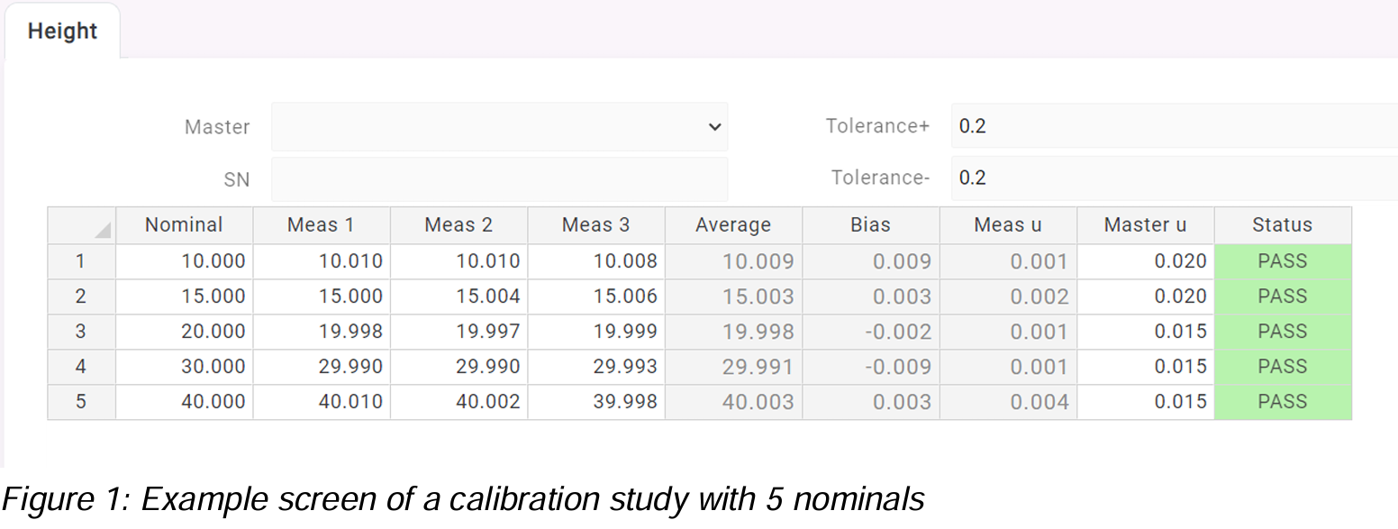
When we perform a calibration study, we check if the calibration results are within the required specification. In figure 1 below you see how a typical calibration study is performed.

Based on the bias and uncertainties, the DataLyzer Qualis 4.0 MSA software establishes if the calibration was acceptable (Pass) or unacceptable (Fail). Basically it means that if the bias + uncertainty is within the specification limits, then the calibration is acceptable.
Looking at the full overview of calibration studies, you can see the results of the calibration studies in time for all your gages, see figure 2. This overview is very usefull managing your calibration studies. But, it does not show us any trend in the calibration data and we don’t know if all calibrations were statistically in control. To get more valuable insights, we need to review Control Charts for these studies.

Adding a Control Chart
It will be usefull to show the calibration study results in a Control Chart. To apply SPC in a useful manner, the results must be normalized. For example, the results of the nominal ’10’ from figure 1 are automatically stored in the Control Chart in the following way:

As you can see the deviation from the nominal is stored. This way it is possible to store all results from a calibration study in one chart.
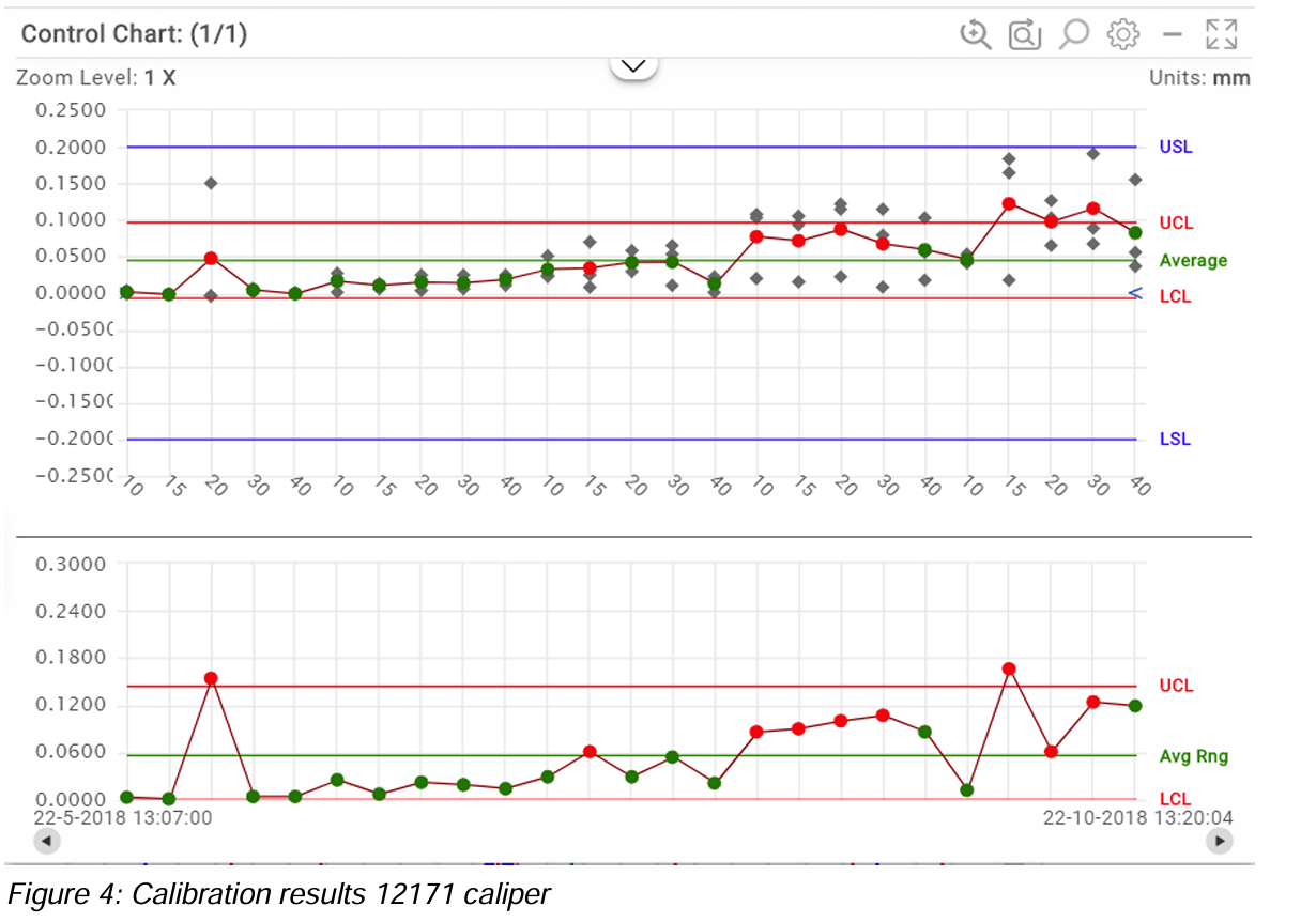
We can now show all calibration results in the Control Chart. The X axis shows the nominals for each subgroup. Each 5 subgroups belong together and have the same calibration id. In the first Calibration Study, third measurement you can see a clear Out of Control for nominal ’20’. During the Calibration measurement, a special cause of variation has occurred.

Control Charts help us to find causes of variation during the calibration, but it also shows us if the gage is drifting in time. In figure 5, you see the complete history of the gage calibration. From the chart, you can clearly see that the gage is drifting in time and that the variation is increasing. Although none of the calibration measurements is out of specification, the application of measurement uncertainty and master uncertainty caused the Calibration of nominal ’15’ in the month of October to result in a Fail.
We always try to avoid a fail during calibration because a fail means all measurements since the last successful Calibration are suspect and basically should be remeasured!
The Control Chart is giving us all kind of signals that the gage is not performing as it should:
• We have various out of controls on the average and range chart (see figure 4)
• The Ppk value clearly indicates the gage is about to fail.

In figure 6 you see a Histogram for the Calibration results of the last 5 calibrations. The graph and Ppk value (0.94) clearly indicate that the gage was not performing in October as it should perform, and it is just chance if a Calibration study will fail. After the Calibration in October, the gage is repaired so in the control chart we start with a “new” calibration process indicated by the orange line in figure 5 and the Control Limits are recalculated.

Conclusion
In this blog we have shown the added value of applying SPC during the Calibration process. Applying SPC during Calibration provides better and more useful information and makes it easier to predict if the next study will fail. Based on Control Charts, you can take actions quicker to prevent failures during Calibration.
In real life, it is important that these results are automatically available, and no repeated data entry is required. So, in the DataLyzer suite of software solutions, if you enter the results during a Calibration Study, the Control Charts can be automatically created with all graphs being instantly available. During the Calibration Study, SPC alarm messages can be generated.
Discover how DataLyzer and our Qualis 4.0 SPC and MSA Gage Management software can help you to implement efficient Calibration Studies integrated with Control Charts. Our team of experts is ready to show you how our webbased solution can be tailored to your needs.


